
ON PAPER
Work on Paper
I like to work on paper as a palette cleanser to the work I do on glass, which can take weeks of work and patience to complete.
Paper, by contrast, is fast. Sometimes a piece is designed and executed in under a day. Sometimes they take a little longer but they’re never as time consuming as my glasswork. And they’re much cheaper and less stressful to make!
The lower stakes and immediacy of paper bring out a different style in my work. And I often find myself creating series of works on paper in intense batches of industry.
So that’s how I laid them out here, as separate collections of work. These have all been painted with enamel poster paints.

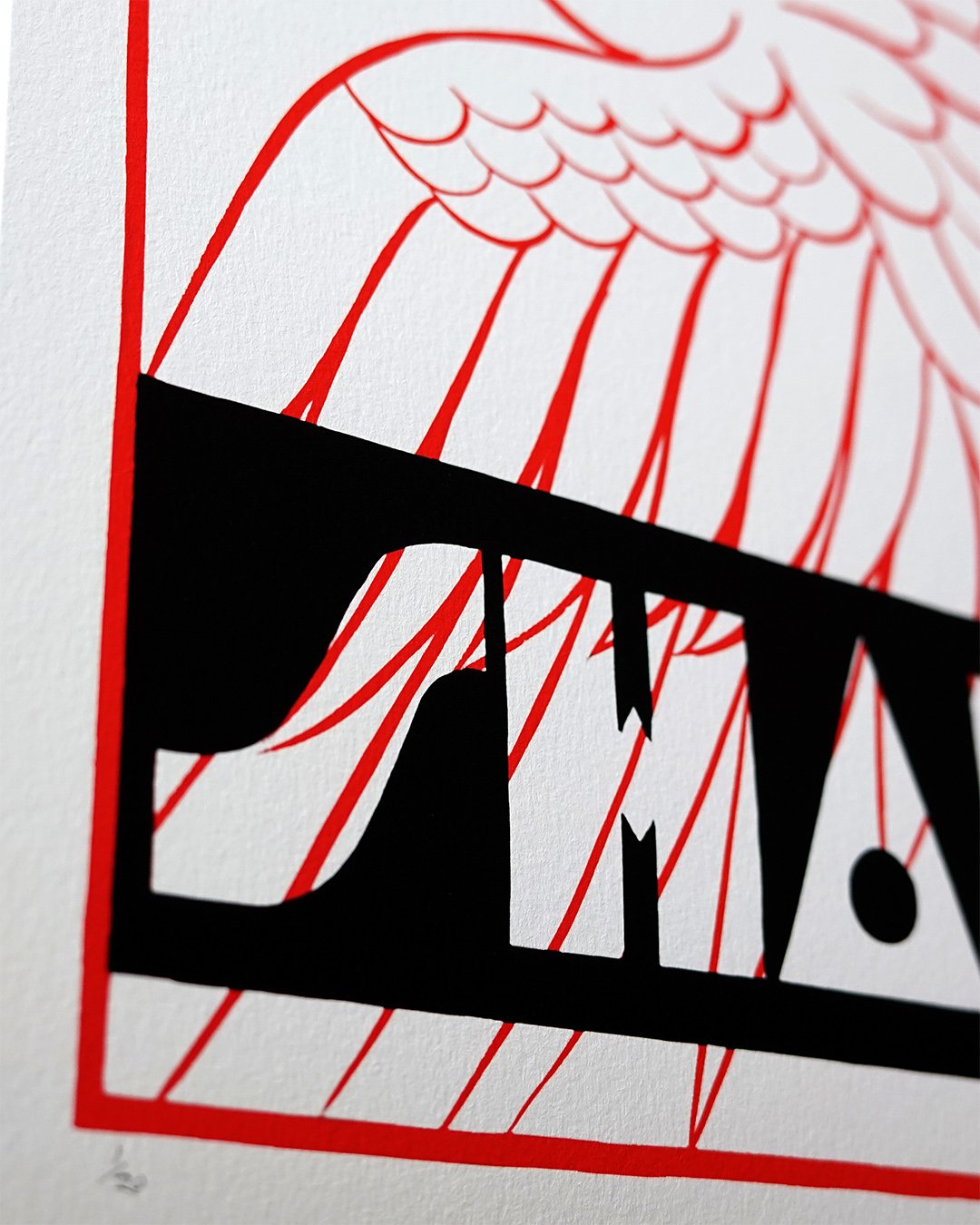
A1 IN MAY
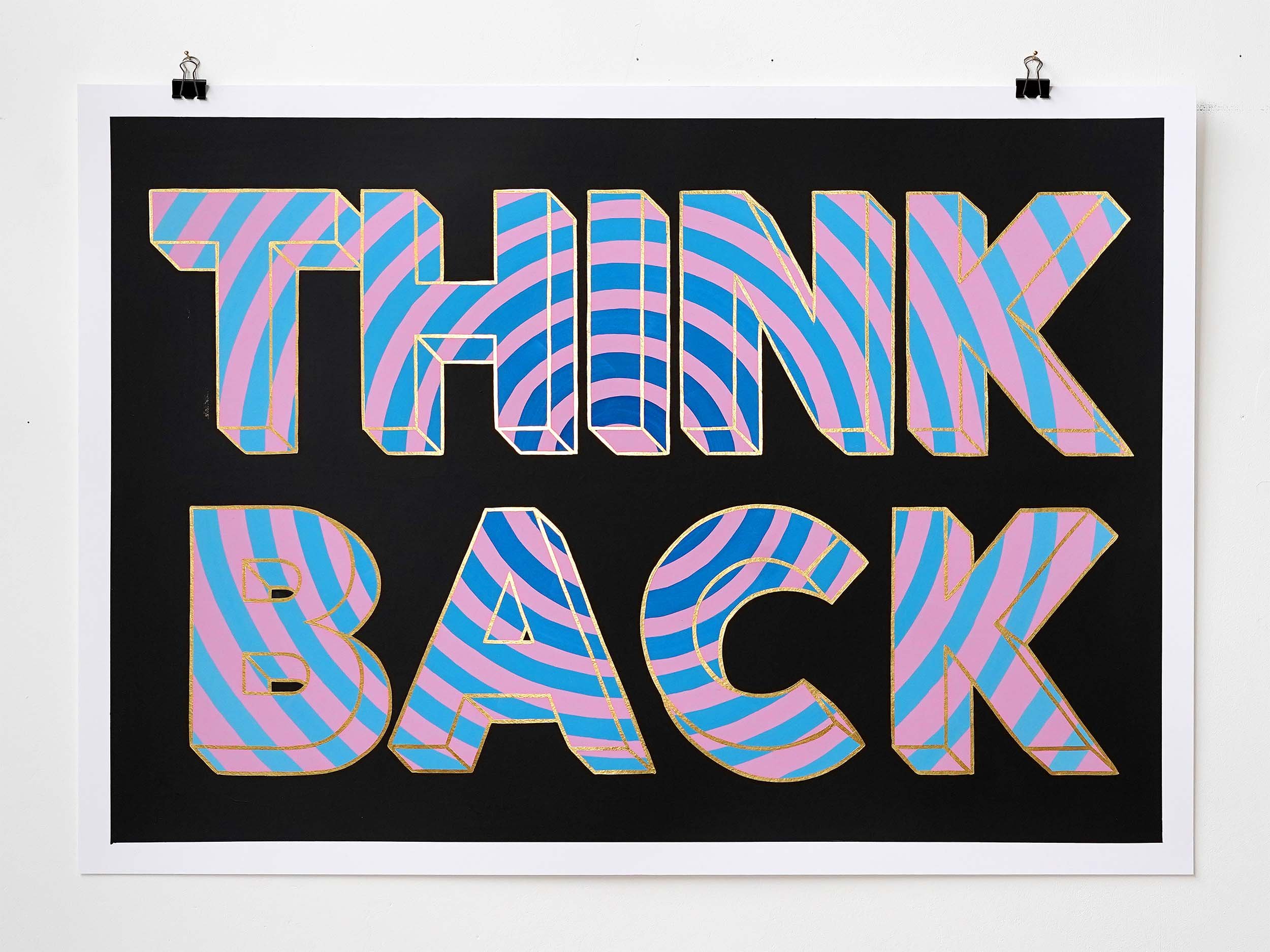
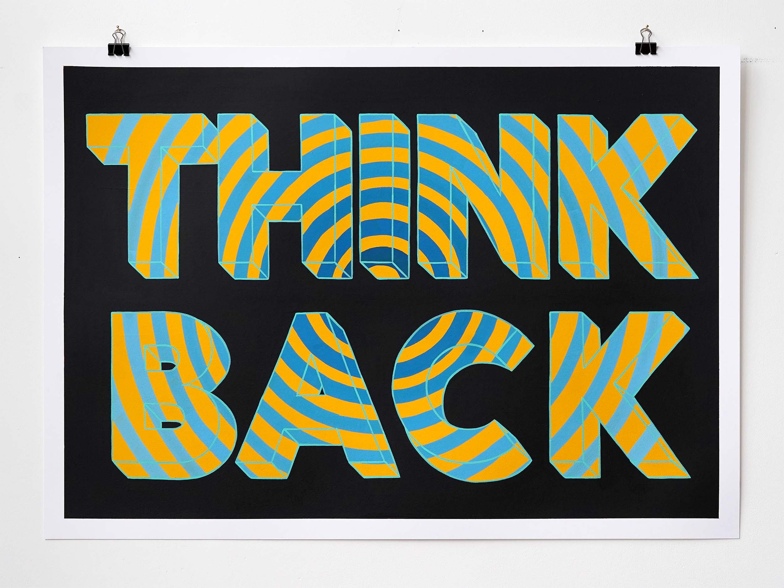
One of my favourite bodies of work ever, ‘A1 in May’ was a self imposed project started in May of 2020 in the early panicked days of the pandemic. To try and break a long period of creative block I set myself the challenge of creating an A1 painting every day for three weeks.
Block Begone
By the time the three weeks were up I felt creatively reborn.
And for my audience stuck at home following along with the creating had been a cathartic exercise.
The original A1 posters were all painted with a limited palette of oil based enamel poster paint on A1 sheets of card.
Once all the original posters sold I created a series of prints that were hugely popular. The success of that project set me on a path that led to a whole new era in my output.
I spent the rest of the pandemic taking a long sabbatical from any commissioned work to continue making and releasing more editions that were posted all over the world for people to hang on their walls and help ease the boredom of endless isolation.

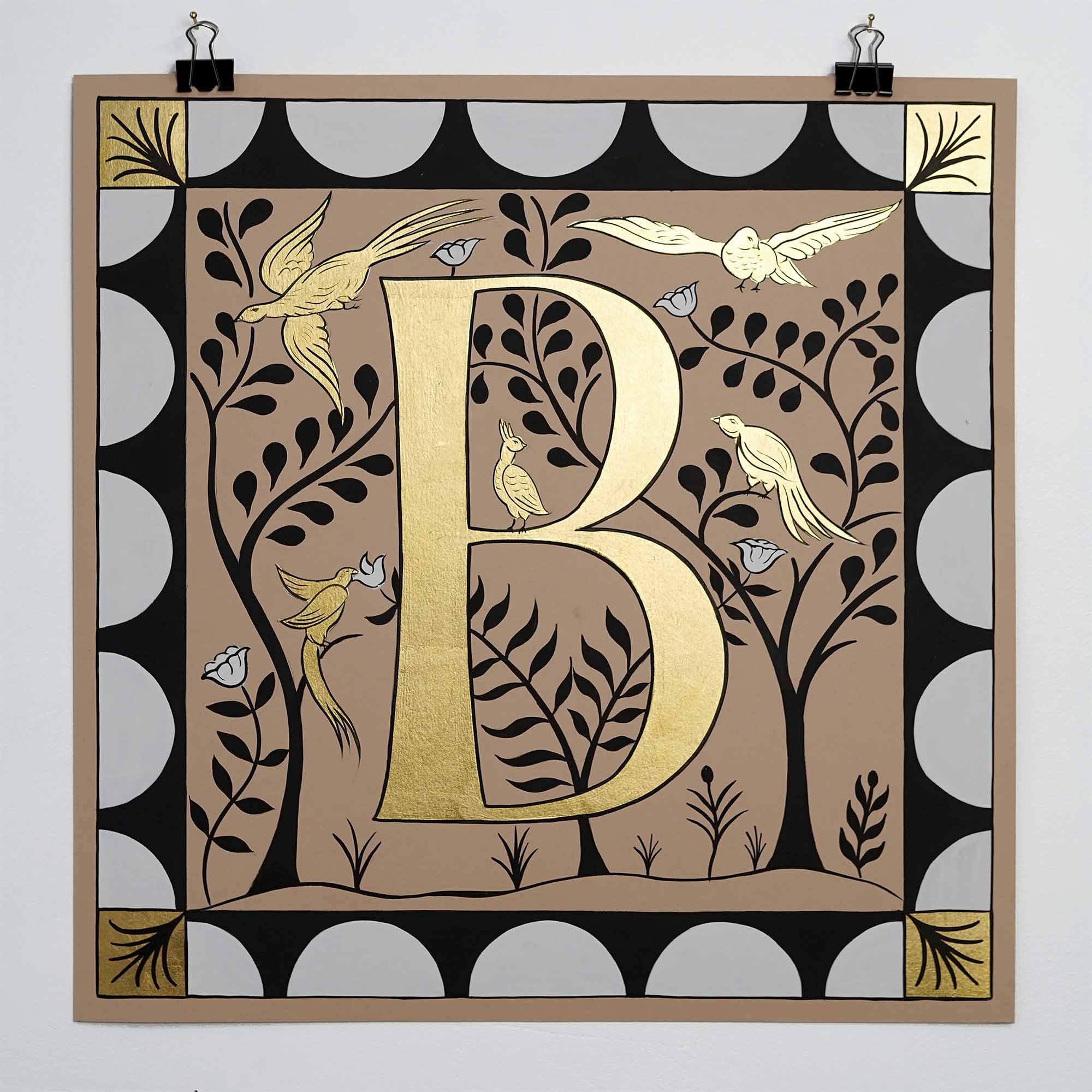
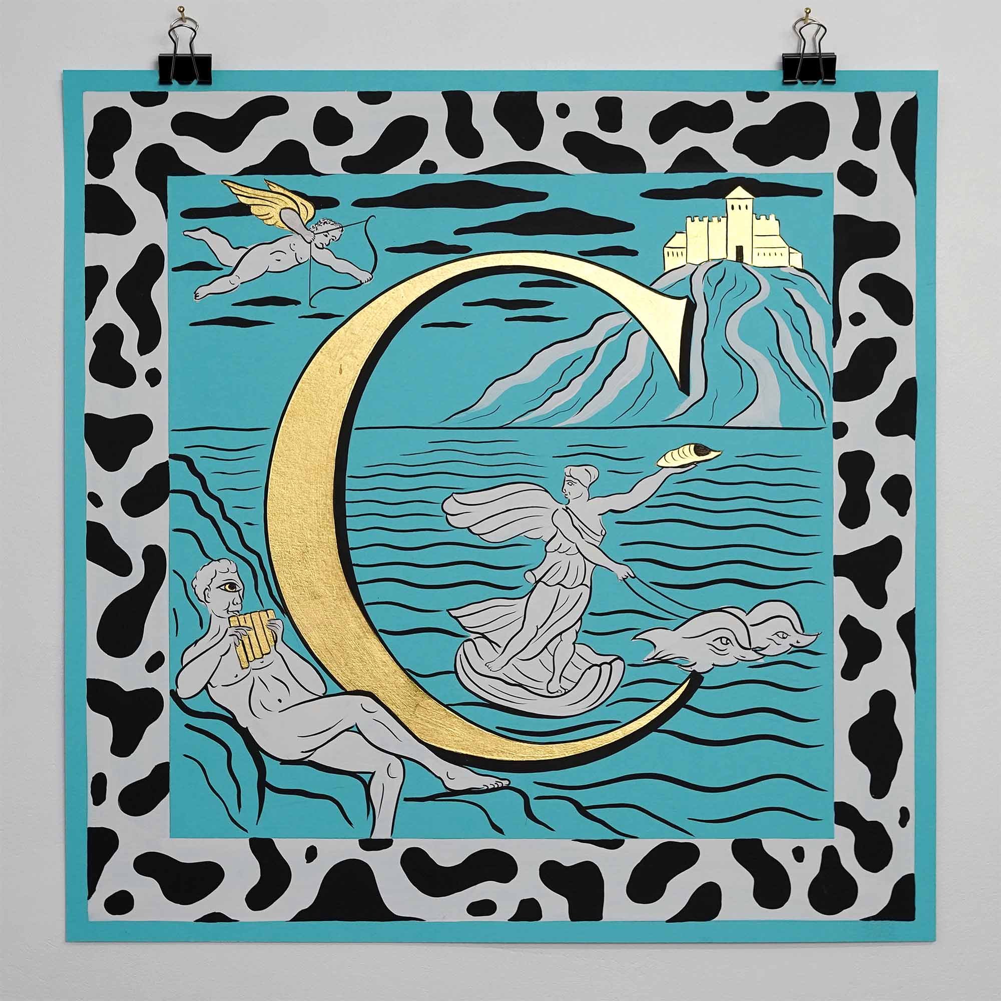
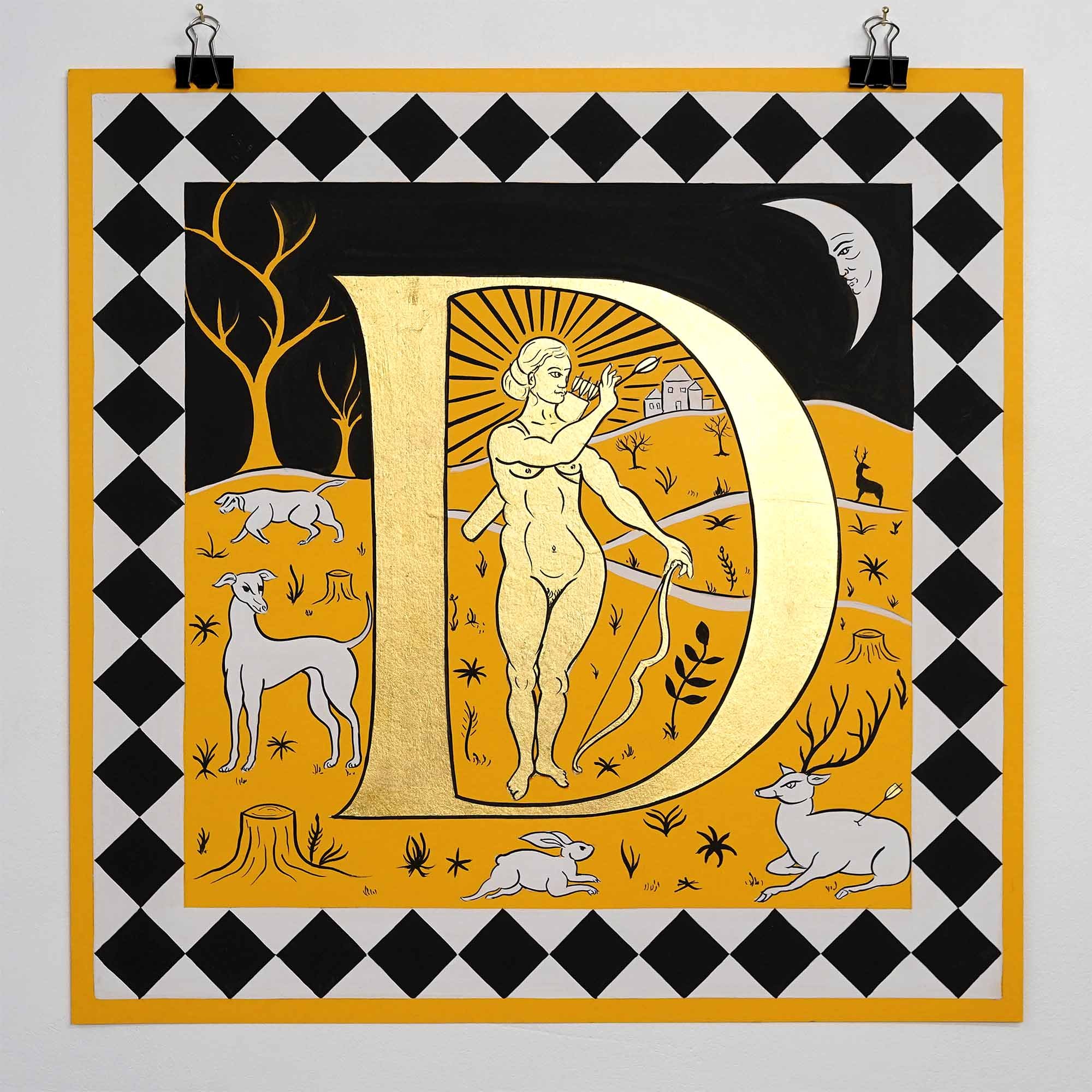
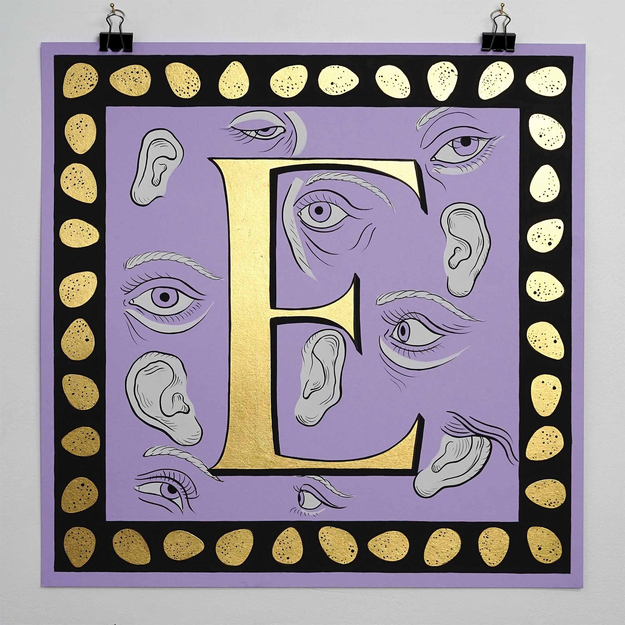
The Ornamental Alphabet
My Ornamental Alphabet series was inspired by the elaborate initials created during the Renaissance by master engravers like Albrecht Dürer which adorned each character with scenes of earthly and celestial life.
I made mine an alphabet of association that referenced different classical myths, folklore, sacred plants and Biblical stories. So A is for Adam and Eve, H is for Hercules and M is for Mandrake.
More childlike in its palette execution than the works that inspired it I wanted this alphabet to be playful rather than stoic and educational.
The original works on paper were made with just black, white and 23.5 carat gold.


MY TYPE ON PAPER
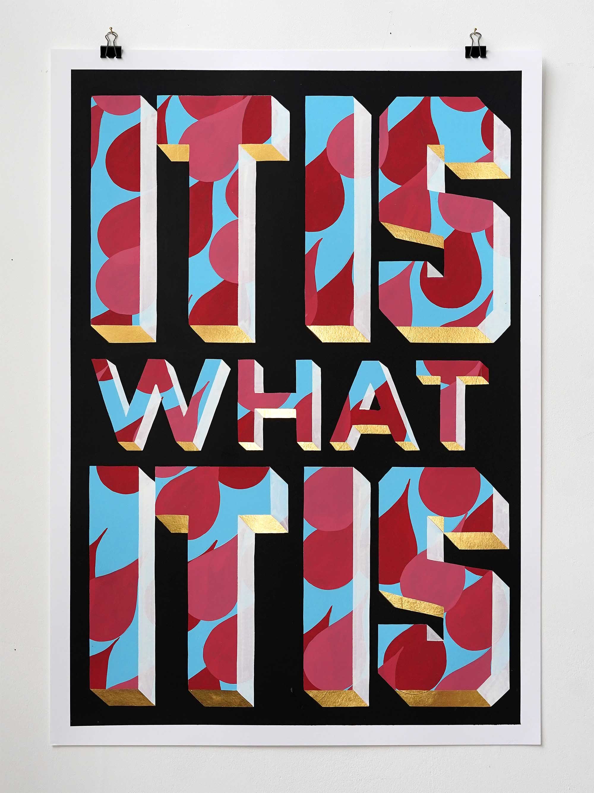
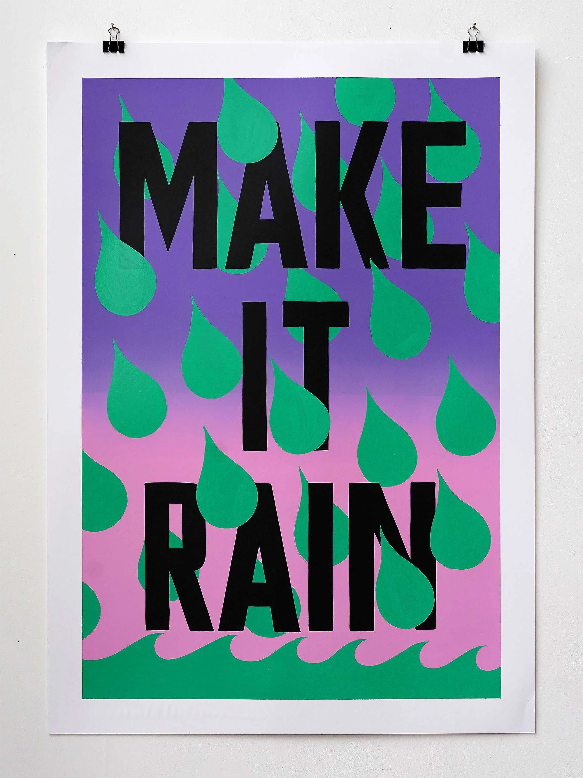
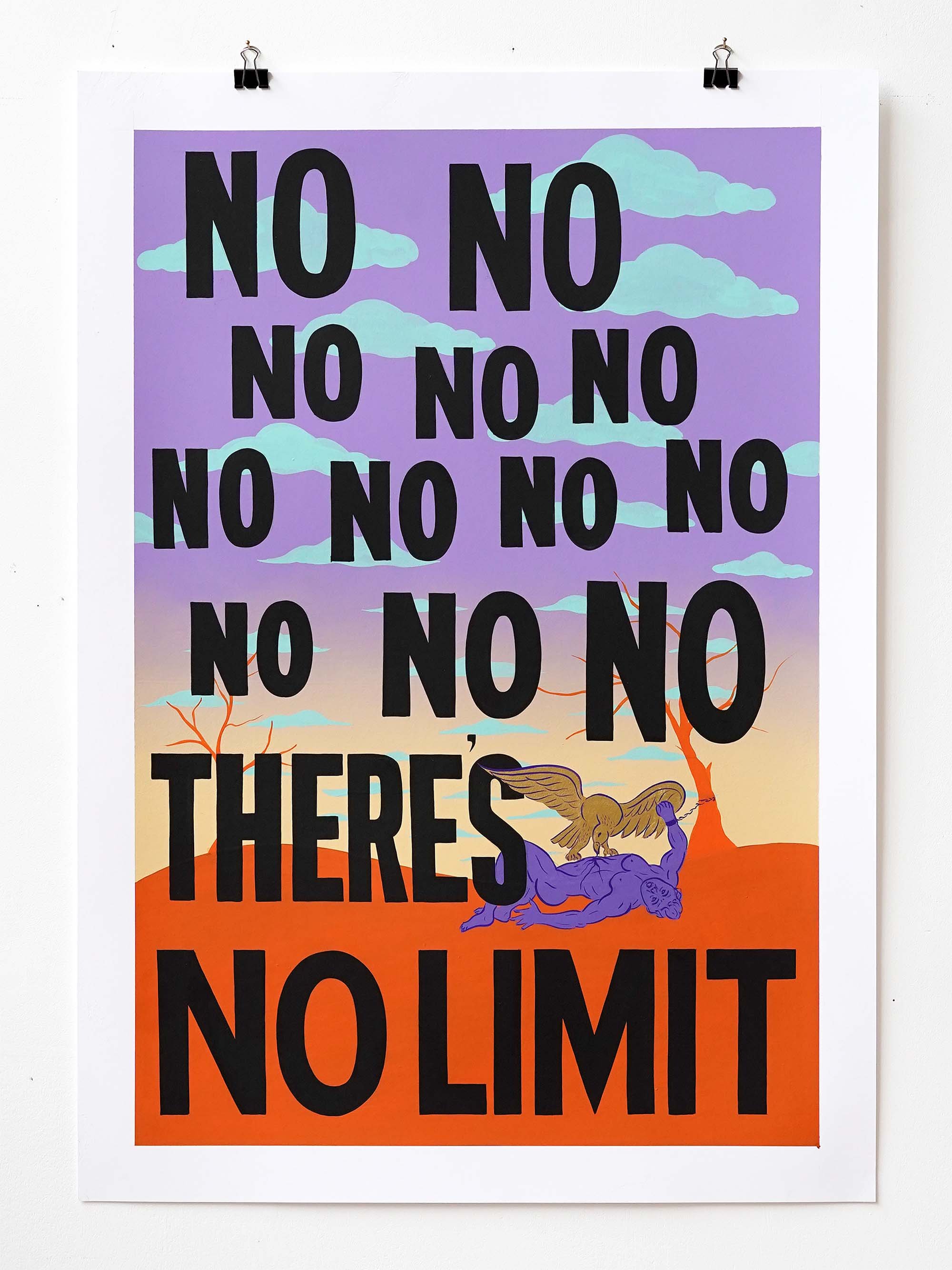
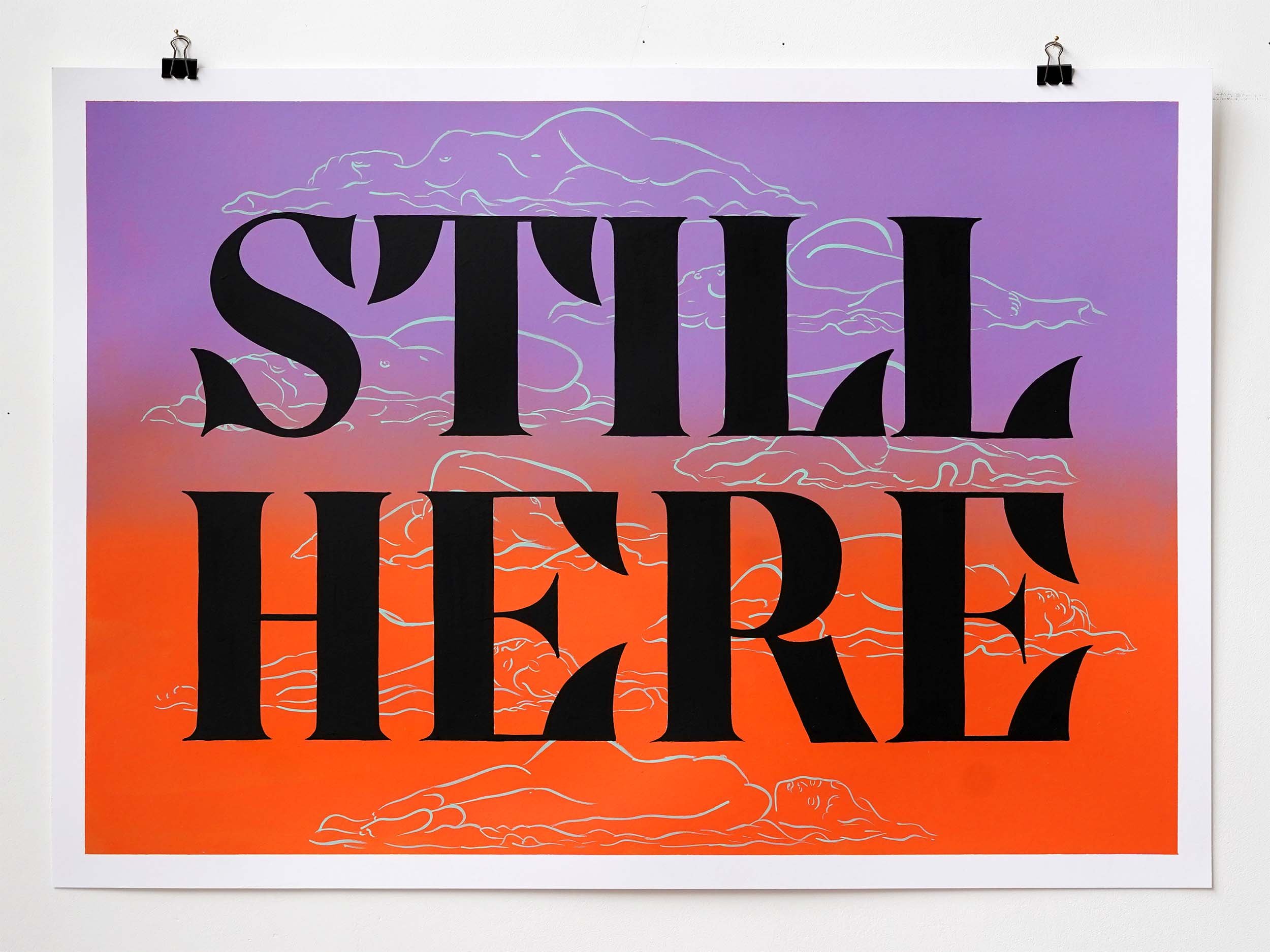
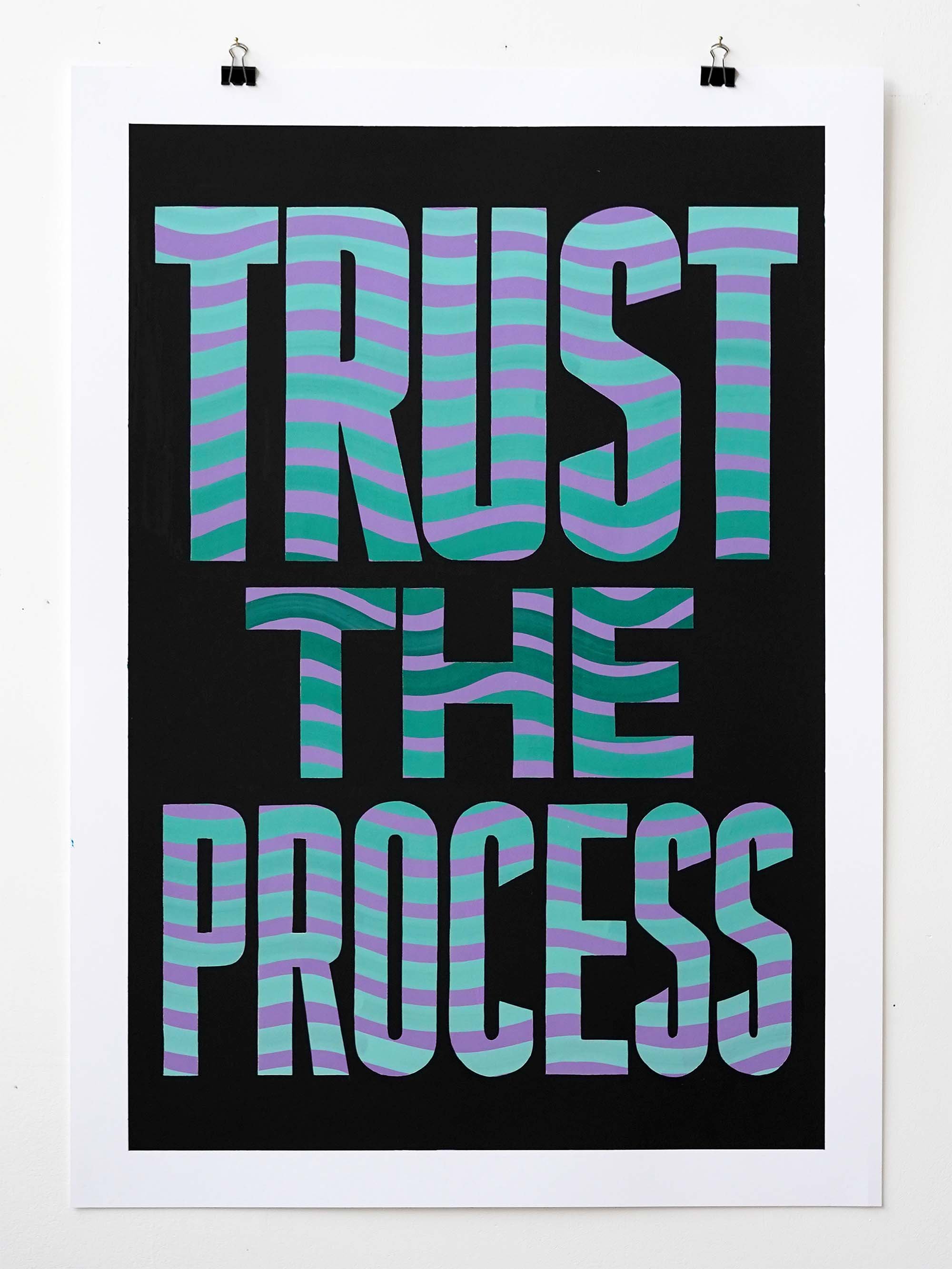
‘MY TYPE ON PAPER’ was the title of a solo exhibition of work on paper that I put on at 1 Mare Street Gallery in November 2023.
In the show I explored the prominent role of motivational cheese in typographic work. Snappy little positive mantras are incredibly popular but they fail to acknowledge that a lot of the time things will go wrong.
So my take on this flavour of cheese was to deliver it with a side of tough love, and acknowledge that personal progress only comes through a perilous trek in the lands of failure, anxiety and loneliness. It is what it is.
Some of the original paintings from the show are still available from my shop.